

THE STORROW DRIVERS
Visual Identity, Illustration, Advertising
/ CATEGORY
Research, Brainstorming, Layout, Design, Illustration, Lettering, Typography, Color Palette
/ SKILL
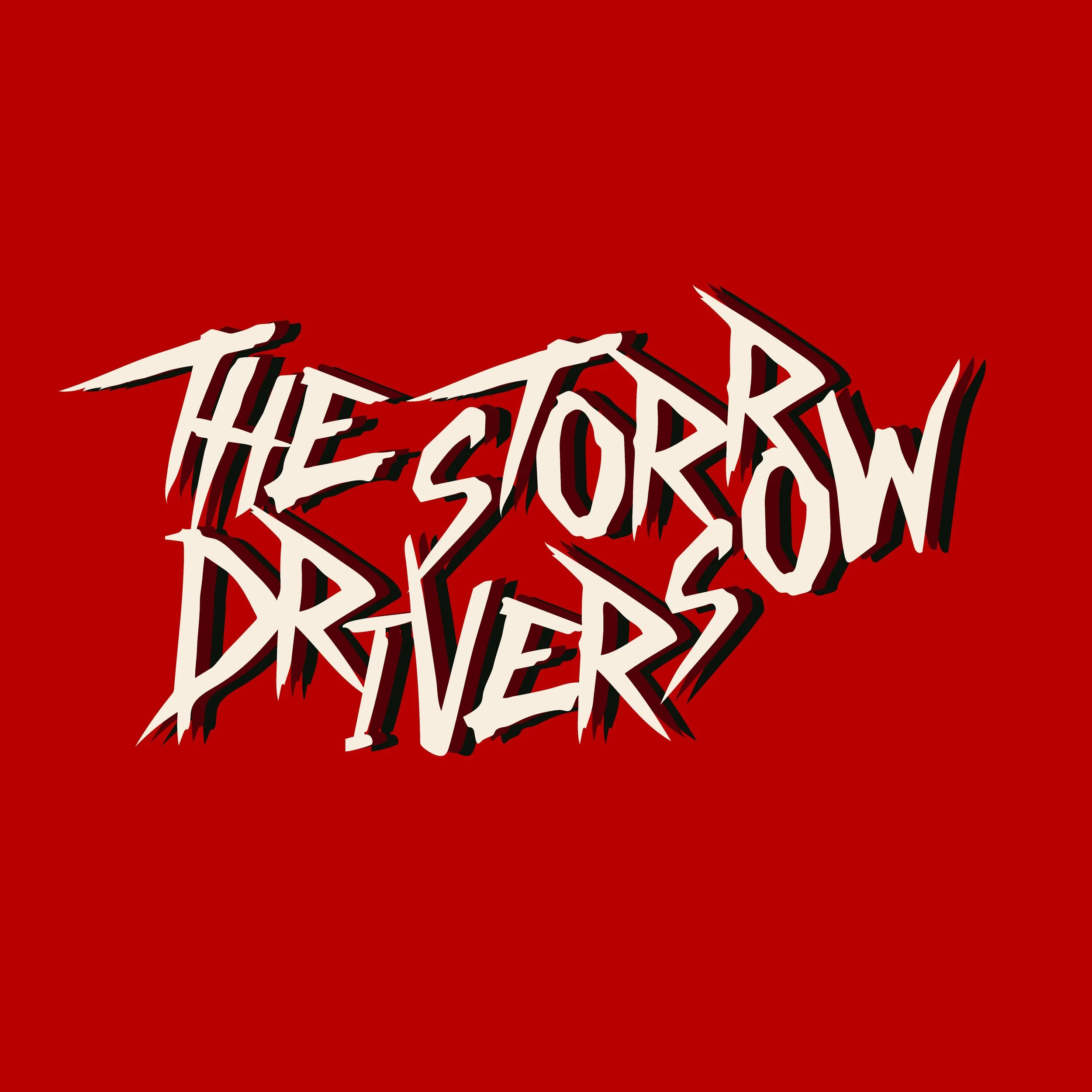
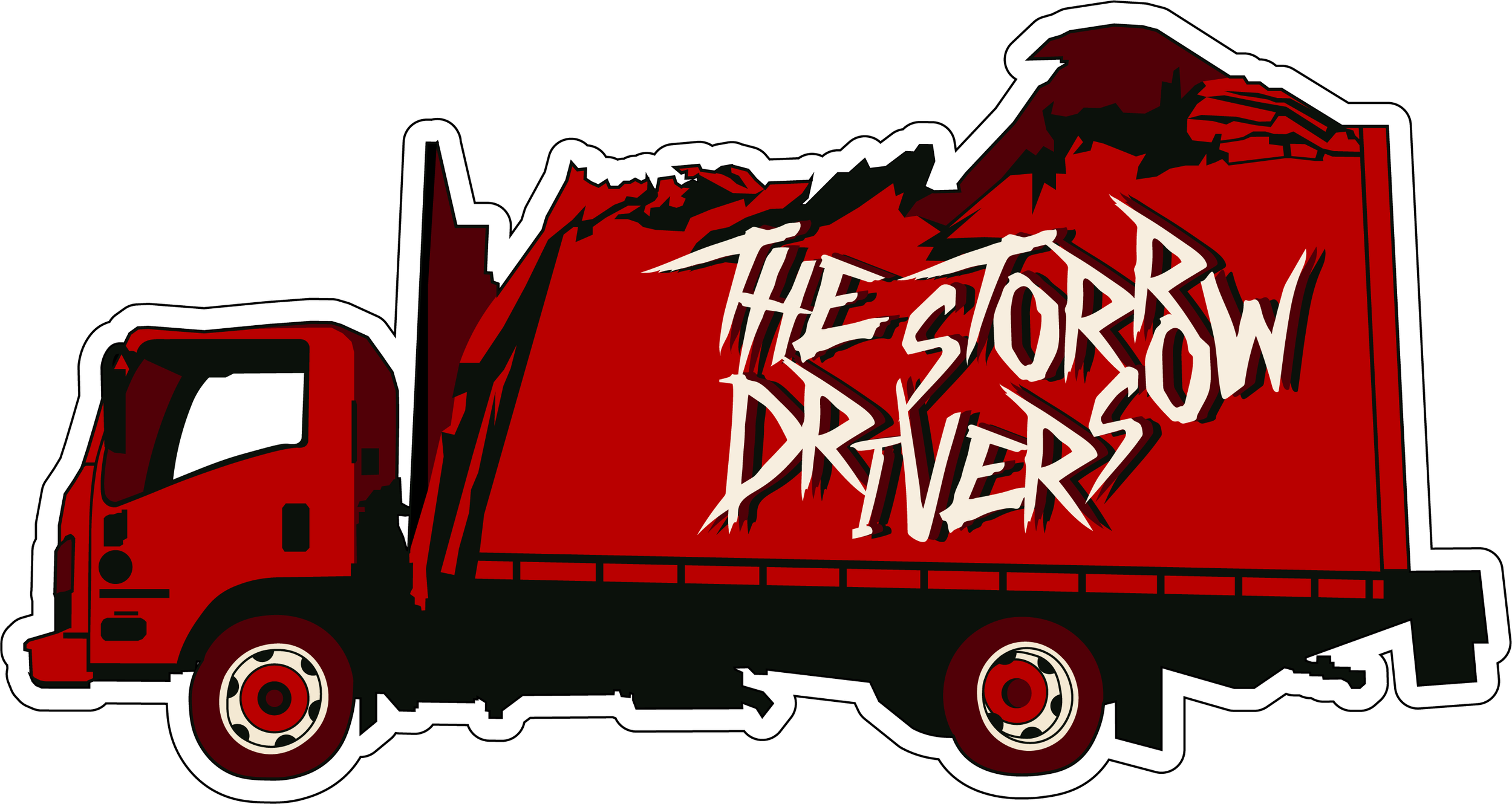
Primary Logo & Trademark (usable for merchandise)
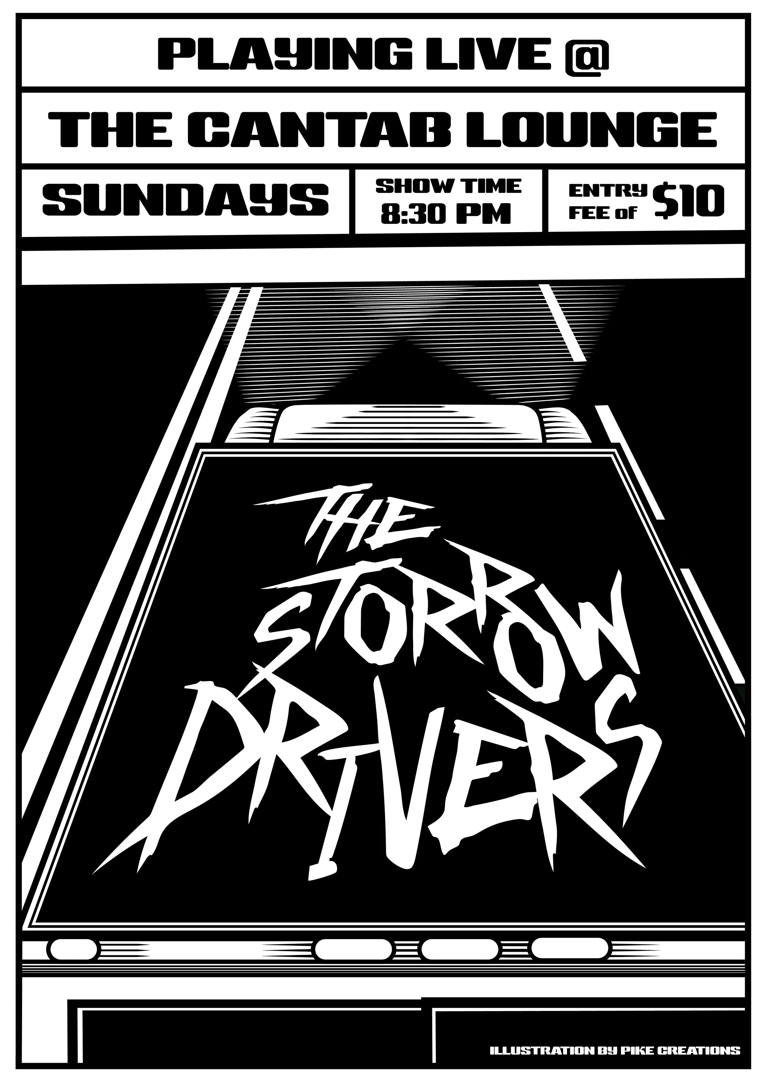
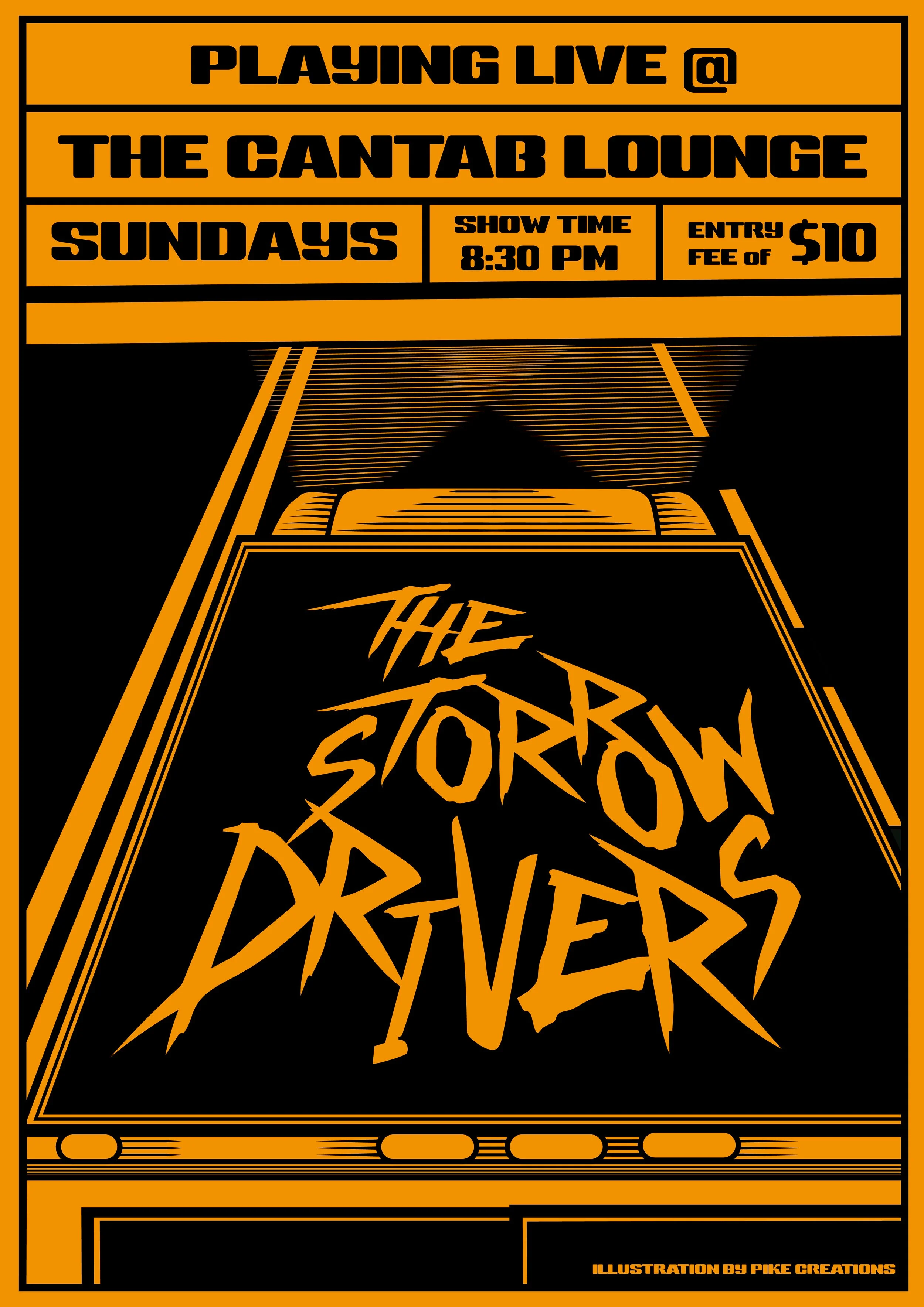
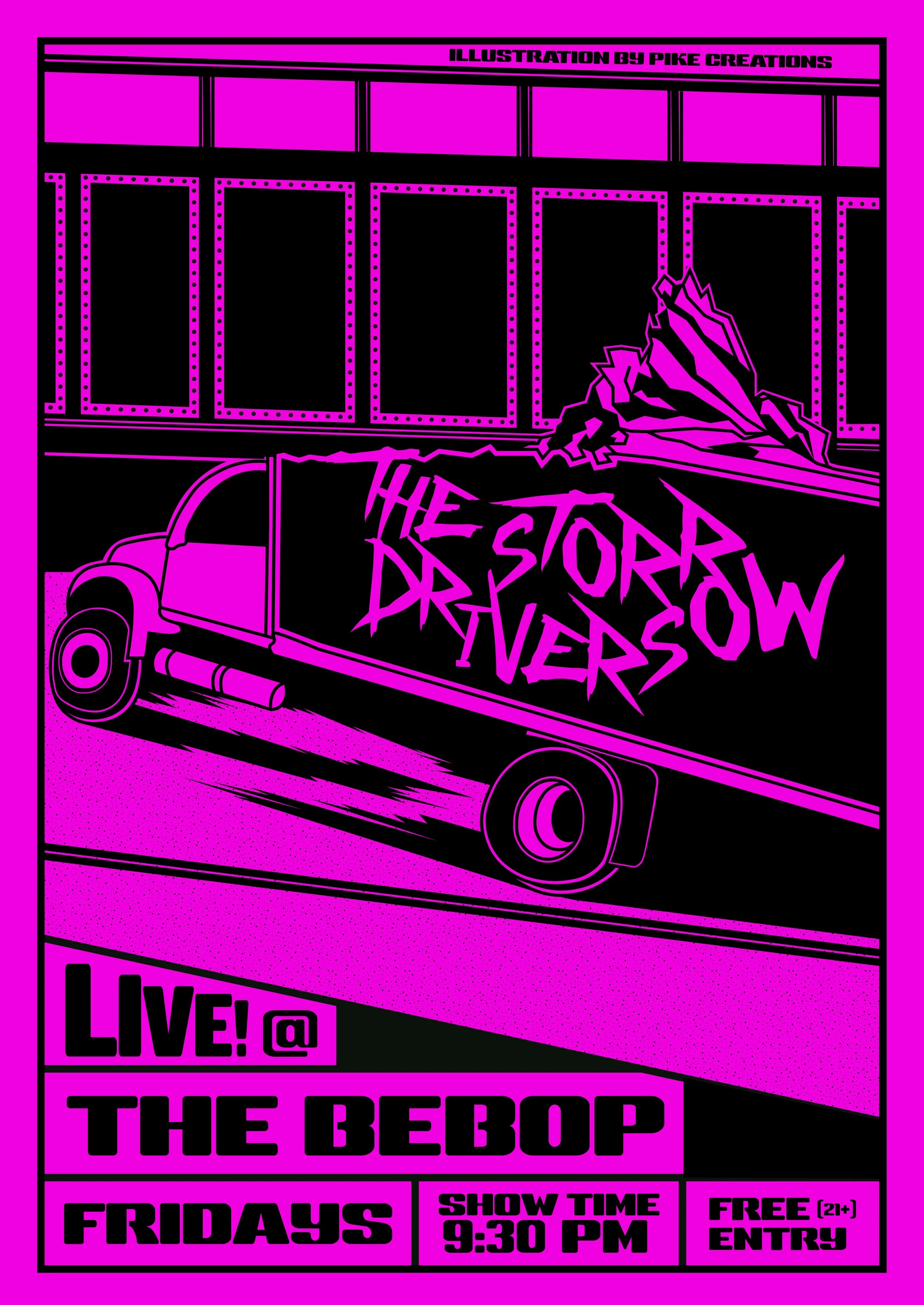
2 Promotional Event Posters
Custom Color Palette
Lettering
Typography
/ DELIVERABLES
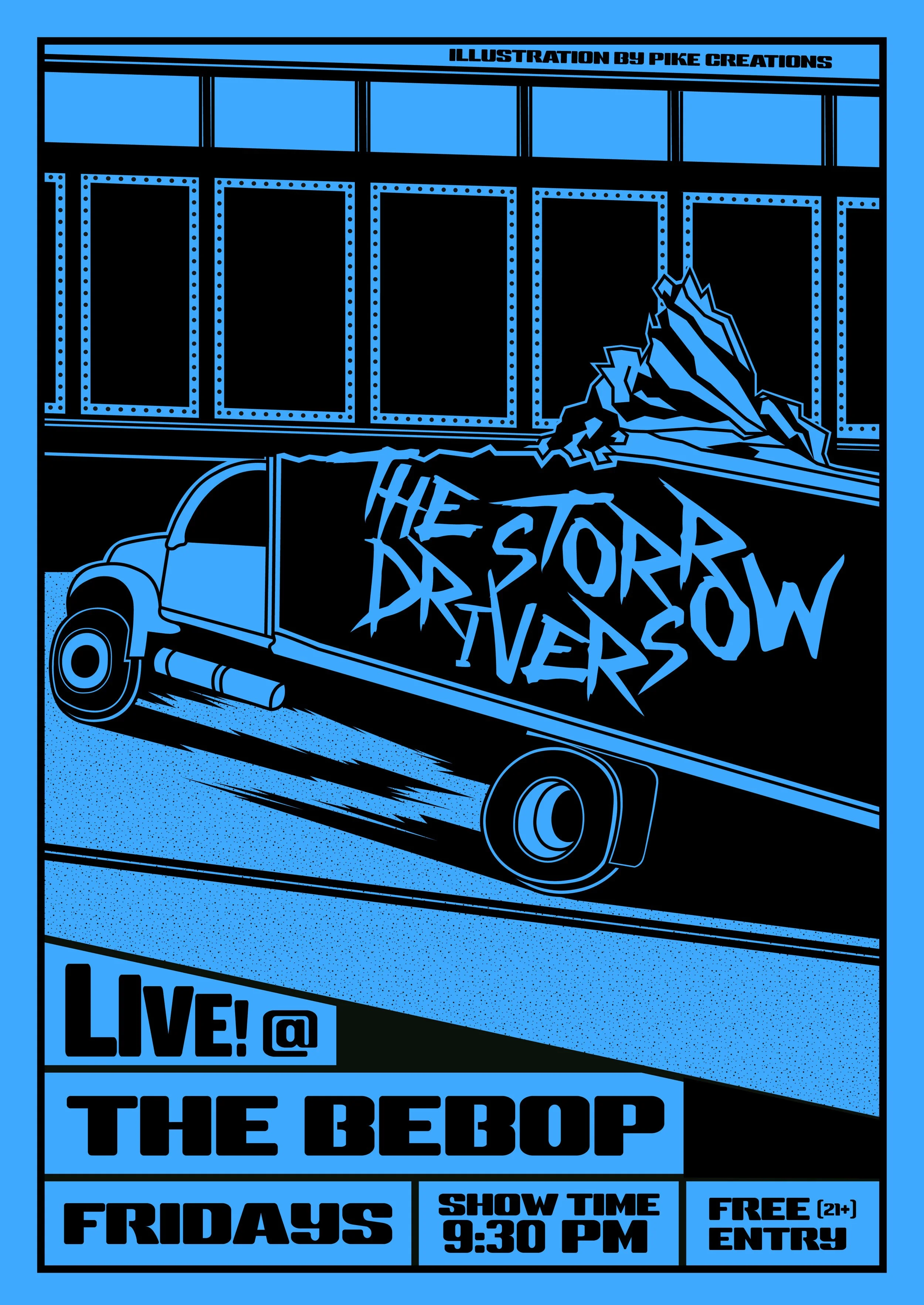
Storrowing, or getting Storrowed, refers to when big moving trucks and box vans (vehicles typically used during college move-in week) get stuck or have their roofs ripped off by the low bridges that run across Soldiers Field Road, Memorial Drive, and most famously, Storrow Drive. As this happens every year, no matter how many warning/clearance signs are hung, this event has become an annual tradition and meme for local Bostonians.
/ OVERVIEW
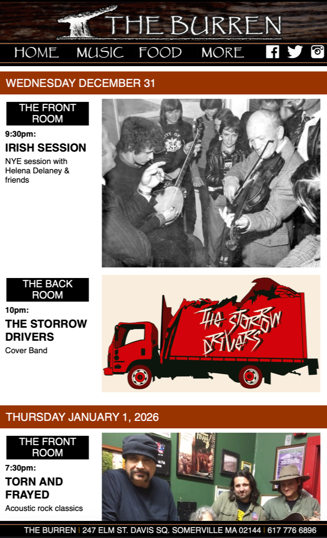
Based in the heart of Boston, The Storrow Drivers are a high-energy rock band continuously making a name for themselves. Formed less than a year ago, the band has expanded their reach to venues in Boston, across the river into Cambridge and Somerville, and have potential gigs planned in New York.
In wanting to have a band name that sounds relevant, but also resonates with the local community, The Storrow Drivers was born in commemoration of the infamous Storrowing event that happens every year, without fail, during the first week of September.
The Challenge: how do we create a visual identity that reflects the band’s high-energy and intensity; as well as pays homage to its namesake. Bonus Points: Create a few poster illustrations that are both simplistic in design but striking in contrast.
Through research and brainstorming, The Storrow Drivers’s visual identity draws influence from the gritty, yet energetic lettering and design used in both the punk and rock n’ roll genres.
THE STORROW DRIVERS
THE STORROW DRIVERS


GRAPHIC POSTERS