

NIKE / BILLBOARD AD


JUST DO IT
-
JUST DO IT -
Advertising
/ CATEGORY
Brainstorming, Layout, Illustration
/ SKILLS
Entire process was done using Adobe Illustrator
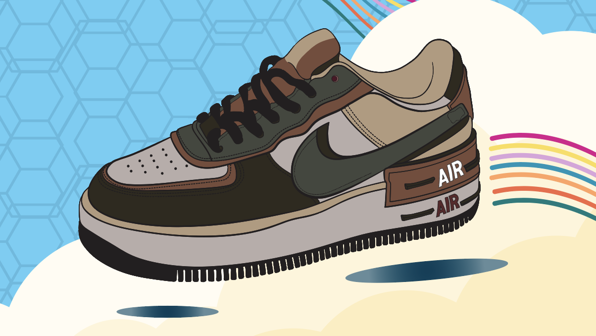
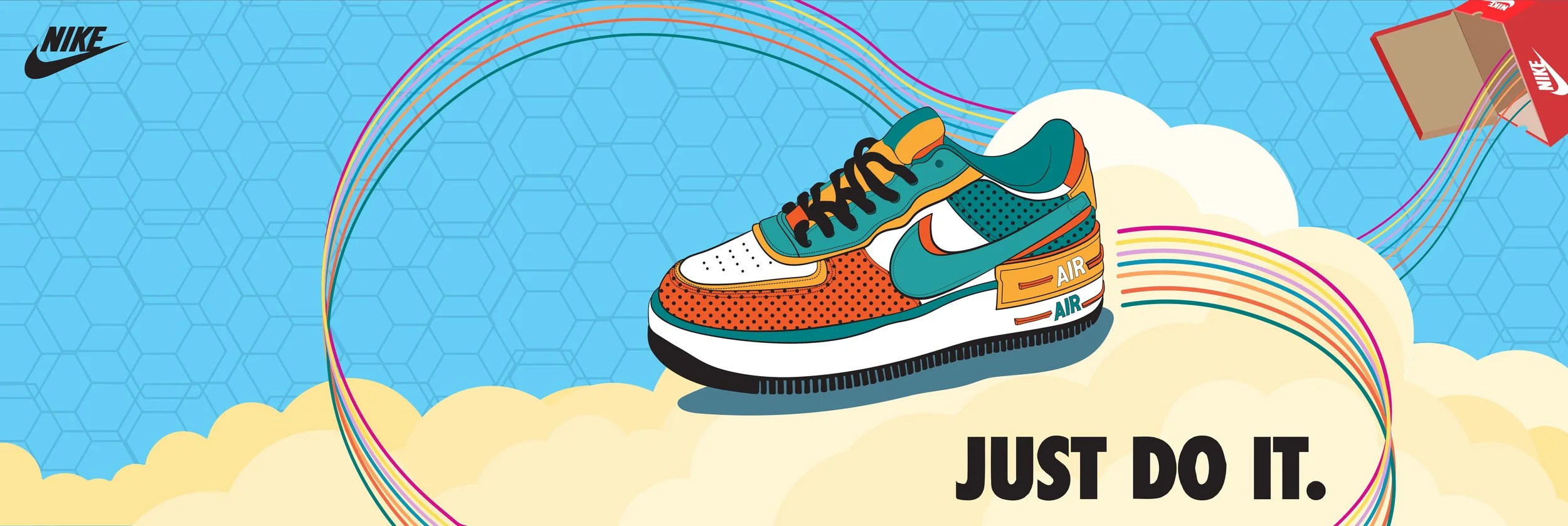
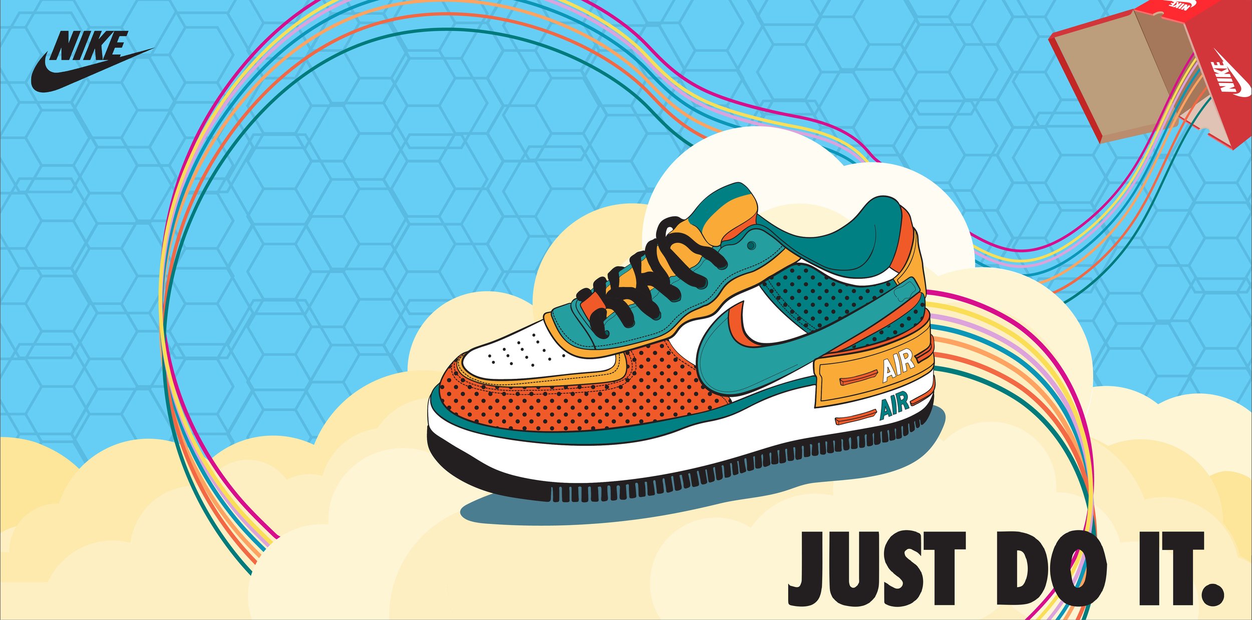
After noticing a majority of Nike advertisements being primarily of photography, I wanted to illustrate a billboard add for what I imagined a relaunch of one of the Nikes’ shoes would look like.
The Challenge: Create a shoe add for Nike that is both vibrant in color and dynamic in movement.
/ OVERVIEW:
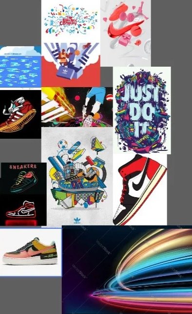
RESEARCH / MOODBOARD
In the beginning stages of working on a project for an existing organization, a part of my process involves researching and analyzing what the organization has done in regards to past projects. This allows me to understand what type of “image” the organization wants to portray and if I can find any patterns in past projects that solidify that image.
With Nike advertisements being primarily of photography, I had to extend my research a little further and see what other sports brands have done in regards to shoe adds via illustration.
After deciding the classic Air Force 1 was the targeted shoe focus for this billboard add, I continued to brainstorm ideas of how I wanted the shoe to be represented. Taking the word “air” and wanting to emphasize on how Air Force 1 shoes making you feel “lighter than air”, I illustrated the concept of an Air Force 1 zipping out of a shoebox and flying through the air in the clouds.
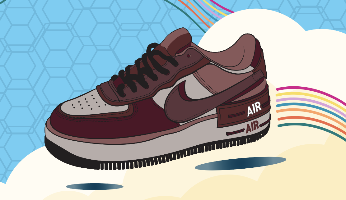
After finalizing the layout, I also went through various color/pattern models of the Air Force 1 shoe (as a more colorful version of the shoe seemed better suited for this add vs. a simple all white one).

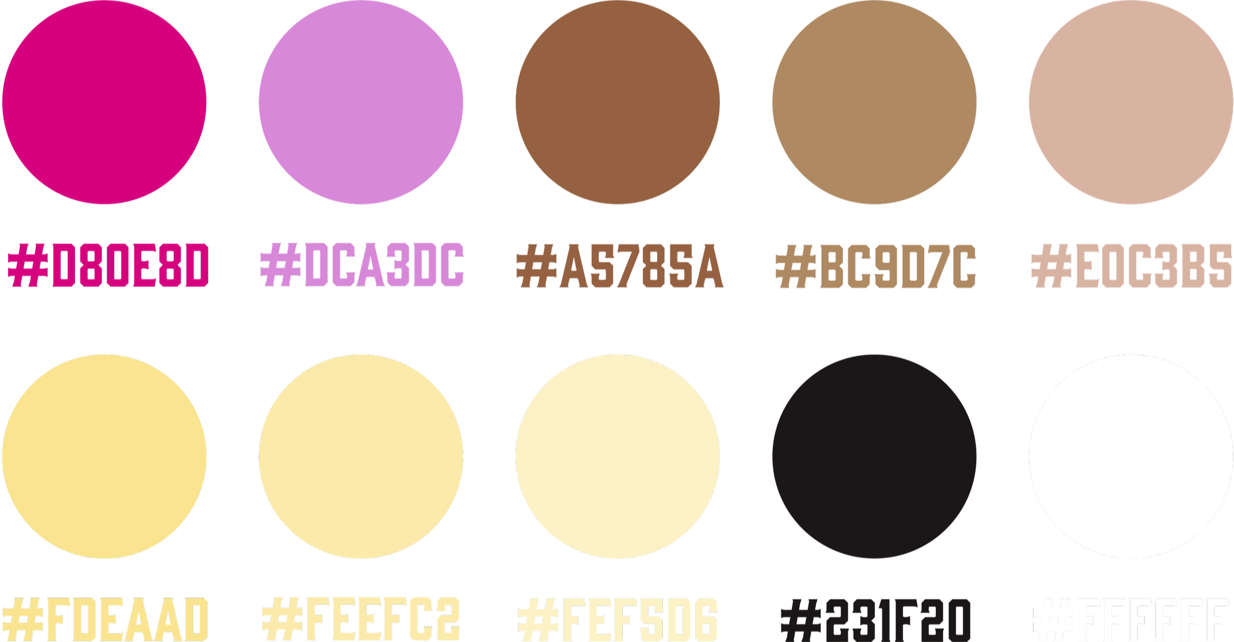
COLOR PALETTE